 On my visit to Seattle last month, I visited the office of data visualization company Tableau. As more and more data gets uploaded to the Web, it needs to be analyzed and made sense of. Data visualization is one of the most effective ways of doing this and Tableau is a leading company in this field. I sat down with Ellie Fields, Director of Product Marketing at Tableau Software, to find out how data visualizations are changing the way people are consuming information on the Web.
Tableau's vision is to "see and understand the world's data." The company has carved out a particular niche with media organizations, who use Tableau software to enable their readers to play with data in interactive way - for example customizing charts.
Sponsor
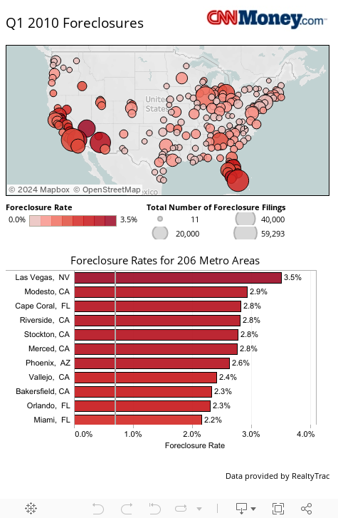
Wall St Journal, CNN Money and Seattle Times are a few of the media publications that use Tableau. One of the more impressive examples was a data visualization on CNN Money, showing where mortgage foreclosures were happening in Q1 2010. Here it is embedded below. You can drag your mouse over a certain part of the country, for example California, to view just the data from that area. Further analysis is possible using drag and drop controls and the small menu at the bottom of the chart.
The idea is that the reader becomes more engaged with the story and dives deeper into data if they wish. It's another part of the evolution of the read/write Web - nowadays people can interact with data, not just read it.
Tableau's goal is that anyone who cares about data should be able to work with it. But often there has already been a lot of work done on the data from so-called "Data Journalists" - who have been adopting Tableau's software with glee. There is a term for this type of reporting: Computer Assisted Reporting (CAR). CAR has been around for a while, but Tableau makes the process faster and saves journalists from doing custom programming. According to Tableau's Ellie Fields, "fast authoring has been a big driver of uptake" among data journalists.
Tableau has a range of products, including the premium Tableau Digital (used by the aforementioned media companies) to the free Tableau Public (aimed at bloggers). The free version has size restrictions and the data has to be shared to the cloud for anyone to use. The premium versions allow you to keep your data private if needed. There's also a corporate product called Tableau Server, which sits inside the firewall.
So far Tableau claims to have published 10,000 visualizations.

When you think pretty data on the Web these days, the iPad is usually front of mind. Tableau is currently developing an iPad app, which is expected to be released this month for corporates. A public version of the iPad app will be released in future, but no timeframe has been given yet. The iPad app will allow for touch screen scrolling through of data, pinch down, and more.
Mobile is a big area for data visualizations, Ellie Fields told me. "People are making decisions when out and about, not at their desks."
I asked whether there will be a destination site for data visualizations, where consumers can come to browse different visualizations. However that is not on the company's roadmap, Fields replied. "We are not trying to drive traffic from publishers."
Tableau is one of the most visible (pun intended) companies on the Web, graphically packaging up and analyzing the ever increasing amount of data on the Internet. That trend will continue to ramp up, so keep your eyes peeled for more and more data visualizations in your online media experience.
Disclosure: ReadWriteWeb partnered with Tableau last year for a graphing contest.
Discuss
Sophia Bush Megan Fox Michelle Malkin Charlies Angels Rose Byrne
No comments:
Post a Comment